Alex Duin
GOV.UK content lead Sarah Richards on turning complexity into simplicity
Together with her team at the Government Digital Service (GDS), Sarah Richards was responsible for the innovative transformation that the British government’s online content went through, resulting in the award-winning GOV.UK website. In this interview, she provides valuable insight into what lessons can be learnt from the project.
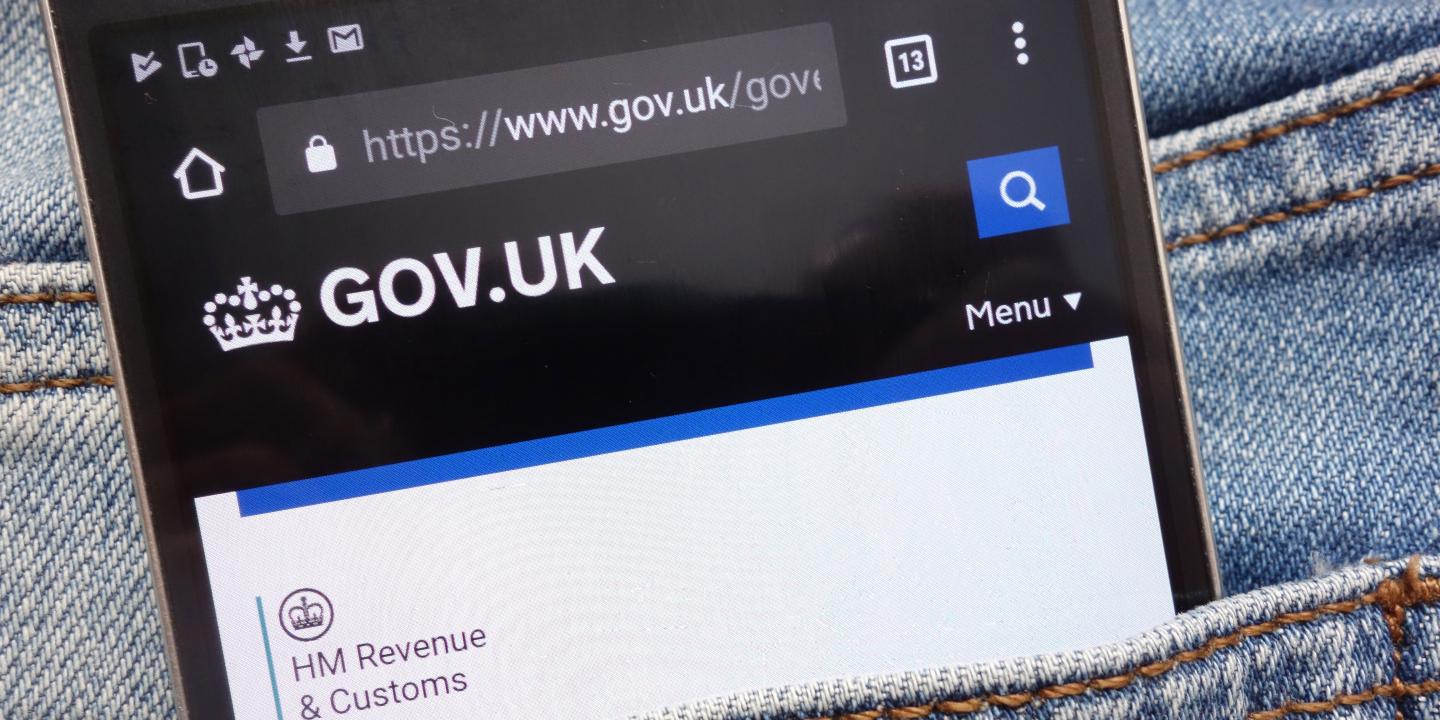
GOV.UK launched in 2012 to rather more fanfare than you'd expect for a simple online portal to UK government services. But there was nothing simple about the audacious task of combining separate websites from hundreds of departments and entities into one usable site. Since the revamp, the GDS has already received top awards from the London-based Design Museum and design charity D&AD.
What is GOV.UK and why was it needed?
GOV.UK is (or eventually will be) the British government's information in one place. It houses all citizen and business-facing information, 24 ministerial departments, both the Prime Minister and deputy Prime Minister's offices plus 331 agency and public body sites. All government information is in one place so it's easier to navigate around and understand, and if you are a repeat user, it's easier to predict what format and style you are going to get.
We used to have separate sites for citizens and businesses, as well as different sites for each government department. With so many places to get government information, it was confusing for users. GOV.UK was a fresh start.
We wanted to publish only user-centred information: only information people need from government, no legal caveats, no jargon, nothing to get in the way of the user task. Most people don't care which government department is doing what, they want to know what they can do and how they can complete their task. So that's what we started with.
What were the greatest challenges in combining so many separate websites into one?
Only one thing really: culture change.
Writing to user need is easy. Very easy. We have a lot of data and insight or if we don't have it, we can go and get it. Navigation is always going to be a big challenge, but we’re working on it and will keep iterating – it'll never stop. The main challenge in the whole project came from people who said things like 'We don't do it that way' and 'It can't be done'. I think we've just proved it can.
Humans are generally nervous when it comes to change and I can understand why. If you are working on a site, improving it and then someone comes along and says 'lovely, but now we'd like to do it this way', you can understand the upset. But we have a motto of 'Show, don’t tell'.
If you can show why something might be better, you are much more likely to bring someone on the journey with you. Just telling people to do things is a world of pain. By showing (and proving the worth of an idea), you end up with the people who were strongly against the project calling you and giving you new ideas.
That’s the best way – then you know you are going to end up with a better website.
How did you keep such complicated content simple to use?
We design around the information. For example, we know a lot of people just want to know the VAT rate in the UK. Others will want to know how to apply or when to get a reduction and so on, but most people just want the rate. So we have very short pages for simple info, and then longer information for people who need it.
The design supports the content we need to convey. One of our design principles is to 'do the hard work to make it simple'. Yes, government is complicated, but mostly there’s no need for the user to go through all of that complexity, so we use a lot of calculators and tools to give users tailored information.
What lessons do you think commercial websites can take from the project?
If the British Government can get rid of jargon, tech-speak and legalese – anyone can! No matter how clever people are or who they are, people are generally more interested in what you say, not the way you say it.
So cut the terrible, dull writing. Make it clear and accessible for everyone.
How did you try to make GOV.UK as accessible as possible to those less likely to use a website to engage with government services?
We made sure all the code is clean and there’s an accessibility lead working on making GDS products as accessible as possible on accessible technologies. More than that though, is the writing: if you make your information as easy to read as possible, you are opening up your information to everyone.
We wanted to make digital services so good that people prefer to use them. Making the site easy to understand and use is how to make a site accessible.
How important do you think a service like GOV.UK is to healthy democracy?
Massively. We put information in a clear, active voice. We banned a whole load of words, and metaphors completely. You can't hide much when the style guide says everything has to be clear.
For the first time, all British government policy is in one place, with no 'spin' allowed. That sort of openness helps people make an informed choice when it comes to voting and speaking about the way the UK is run.
Alex Duin is a member of the Cypres blogging team. He has written for the BBC and many other companies. His specialty is technology and he is based in London.


